> ## Documentation Index
> Fetch the complete documentation index at: https://flex-fields.bjanczak.com/llms.txt
> Use this file to discover all available pages before exploring further.
# SegmentControl
> IOS-style single-select segmented control with sliding indicators, icons, and animated label expansion.
 [← Back to Table of Contents](/docs/index)
### Summary
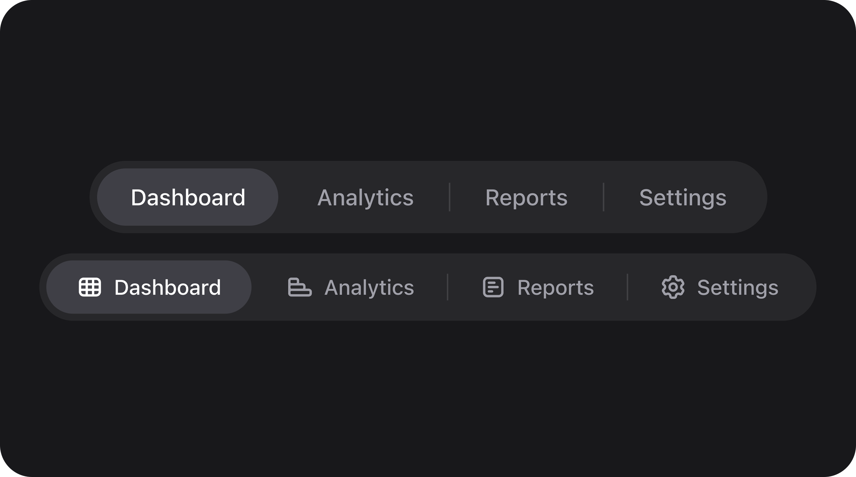
**Single-select** segmented control — alternative to radio lists or selects, with sliding animations, ghost variants, and optional icon-only modes.
| | |
| -------------- | ---------------------------------------------------------------------- |
| **Class** | `Bjanczak\FilamentFlexFields\Filament\Forms\Components\SegmentControl` |
| **State type** | `string\|int` — one option key |
| **Model cast** | `'status' => 'string'` · `'type' => 'integer'` |
| **FieldType** | `segment_control` |
| **Playground** | `segment-control` slug in Flex Fields playground |
***
### Basic usage
#### Standard segments
```php theme={null}
use Bjanczak\FilamentFlexFields\Filament\Forms\Components\SegmentControl;
SegmentControl::make('status')
->options([
'draft' => 'Draft',
'review' => 'In Review',
'published' => 'Published',
]);
```
#### Ghost variant with icons and full width
```php theme={null}
SegmentControl::make('alignment')
->label('Text Alignment')
->options([
'left' => 'Left',
'center' => [
'label' => 'Center',
'icon' => 'heroicon-o-bars-3',
'tooltip' => 'Centered text',
],
'right' => 'Right',
])
->icons([
'left' => 'heroicon-o-bars-3-bottom-left',
'right' => 'heroicon-o-bars-3-bottom-right',
])
->variant('ghost')
->fullWidth();
```
***
### State & validation
#### Stored value
State is the **option key** from `options()`.
```php theme={null}
$record->status; // string|null — e.g. 'published'
```
#### Validation rules (built-in)
| Rule | When |
| --------------- | ---------------------------------------- |
| `nullable` | Always (unless `required()`) |
| `Rule::in(...)` | Value must match a configured option key |
| `required` | When `->required()` |
***
### Configuration API
All methods accept `Closure` unless noted.
| Method | Type | Default | Description |
| ------------------------------------------------------ | ----- | ----------- | ------------------------------------------------------------------------------ |
| `options(array\|Closure $options)` | Setup | `[]` | Option keys => labels or rich arrays (`label`, `icon`, `disabled`, `tooltip`). |
| `icons(array\|Closure $icons)` | Setup | `[]` | Map of option key => Heroicon name. |
| `disabledOptions(array\|Closure $keys)` | Setup | `[]` | Keys that cannot be selected. |
| `variant(string\|Closure $variant)` | Setup | `'default'` | Visual variant: `default` (filled track), `ghost` (transparent track). |
| `color(string\|Closure\|null $color)` | Setup | `null` | Selection accent color. Defaults to `primary` for `ghost`. |
| `separators(bool\|Closure $condition = true)` | Setup | `true` | Vertical dividers between segments. |
| `fullWidth(bool\|Closure $condition = true)` | Setup | `false` | Stretch the control to full field width. |
| `iconOnly(bool\|Closure $condition = true)` | Setup | `false` | Hide labels; show icons only. |
| `expandSelectedLabel(bool\|Closure $condition = true)` | Setup | `false` | Animate the selected segment to a wider width. |
| `size(string\|ControlSize\|Closure $size)` | Setup | `'md'` | Control size: `sm`, `md`, `lg`. |
#### Public helper methods
| Method | Returns | Description |
| ------------------------ | ------------------------- | ------------------------------- |
| `getOptionKeys()` | `array` | Valid keys for validation. |
| `getNormalizedOptions()` | `array` | Resolved options with metadata. |
| `getVariant()` | `string` | Current variant. |
| `getColor()` | `?string` | Resolved accent color. |
***
### Real-world examples
#### Responsive device selector (Icon only)
```php theme={null}
SegmentControl::make('preview_device')
->iconOnly()
->options([
'desktop' => ['icon' => 'heroicon-o-computer-desktop', 'label' => 'Desktop'],
'tablet' => ['icon' => 'heroicon-o-device-tablet', 'label' => 'Tablet'],
'phone' => ['icon' => 'heroicon-o-device-phone-mobile', 'label' => 'Phone'],
])
->default('desktop');
```
#### Date range selector (Ghost variant)
```php theme={null}
SegmentControl::make('date_range')
->variant('ghost')
->separators(false)
->options([
'1w' => '1W',
'4w' => '4W',
'1y' => '1Y',
'all' => 'ALL',
])
->default('4w');
```
***
### Playground
`/admin/flex-fields-playground/segment-control`
See [Playground](/docs/index#playground) for setup.
***
### Related components
| Component | When to use instead |
| -------------------------------- | ----------------------------------------------------------- |
| [SegmentTabs](/docs/segmenttabs) | When segments should switch between different form schemas. |
| [NpsField](/docs/nps-field) | Survey-specific scales (0–10) with survey semantics. |
| [ChoiceCards](/docs/choicecards) | Larger, card-style selection surfaces. |
***
### CSS classes (reference)
| Class | Role |
| ----------------------------------------------- | ----------------------------- |
| `fff-segment-control` | Root wrapper |
| `fff-segment-control--variant-{default\|ghost}` | Visual variant |
| `fff-segment-control--{sm\|md\|lg}` | Size variant |
| `fff-segment-control--full-width` | Full width modifier |
| `fff-segment-track` | Options container |
| `fff-segment-indicator` | Animated selection background |
| `fff-segment-item` | Individual segment wrapper |
| `fff-segment-item--selected` | Active segment state |
| `fff-segment-item--disabled` | Disabled segment state |
[← Back to Table of Contents](/docs/index)
### Summary
**Single-select** segmented control — alternative to radio lists or selects, with sliding animations, ghost variants, and optional icon-only modes.
| | |
| -------------- | ---------------------------------------------------------------------- |
| **Class** | `Bjanczak\FilamentFlexFields\Filament\Forms\Components\SegmentControl` |
| **State type** | `string\|int` — one option key |
| **Model cast** | `'status' => 'string'` · `'type' => 'integer'` |
| **FieldType** | `segment_control` |
| **Playground** | `segment-control` slug in Flex Fields playground |
***
### Basic usage
#### Standard segments
```php theme={null}
use Bjanczak\FilamentFlexFields\Filament\Forms\Components\SegmentControl;
SegmentControl::make('status')
->options([
'draft' => 'Draft',
'review' => 'In Review',
'published' => 'Published',
]);
```
#### Ghost variant with icons and full width
```php theme={null}
SegmentControl::make('alignment')
->label('Text Alignment')
->options([
'left' => 'Left',
'center' => [
'label' => 'Center',
'icon' => 'heroicon-o-bars-3',
'tooltip' => 'Centered text',
],
'right' => 'Right',
])
->icons([
'left' => 'heroicon-o-bars-3-bottom-left',
'right' => 'heroicon-o-bars-3-bottom-right',
])
->variant('ghost')
->fullWidth();
```
***
### State & validation
#### Stored value
State is the **option key** from `options()`.
```php theme={null}
$record->status; // string|null — e.g. 'published'
```
#### Validation rules (built-in)
| Rule | When |
| --------------- | ---------------------------------------- |
| `nullable` | Always (unless `required()`) |
| `Rule::in(...)` | Value must match a configured option key |
| `required` | When `->required()` |
***
### Configuration API
All methods accept `Closure` unless noted.
| Method | Type | Default | Description |
| ------------------------------------------------------ | ----- | ----------- | ------------------------------------------------------------------------------ |
| `options(array\|Closure $options)` | Setup | `[]` | Option keys => labels or rich arrays (`label`, `icon`, `disabled`, `tooltip`). |
| `icons(array\|Closure $icons)` | Setup | `[]` | Map of option key => Heroicon name. |
| `disabledOptions(array\|Closure $keys)` | Setup | `[]` | Keys that cannot be selected. |
| `variant(string\|Closure $variant)` | Setup | `'default'` | Visual variant: `default` (filled track), `ghost` (transparent track). |
| `color(string\|Closure\|null $color)` | Setup | `null` | Selection accent color. Defaults to `primary` for `ghost`. |
| `separators(bool\|Closure $condition = true)` | Setup | `true` | Vertical dividers between segments. |
| `fullWidth(bool\|Closure $condition = true)` | Setup | `false` | Stretch the control to full field width. |
| `iconOnly(bool\|Closure $condition = true)` | Setup | `false` | Hide labels; show icons only. |
| `expandSelectedLabel(bool\|Closure $condition = true)` | Setup | `false` | Animate the selected segment to a wider width. |
| `size(string\|ControlSize\|Closure $size)` | Setup | `'md'` | Control size: `sm`, `md`, `lg`. |
#### Public helper methods
| Method | Returns | Description |
| ------------------------ | ------------------------- | ------------------------------- |
| `getOptionKeys()` | `array` | Valid keys for validation. |
| `getNormalizedOptions()` | `array` | Resolved options with metadata. |
| `getVariant()` | `string` | Current variant. |
| `getColor()` | `?string` | Resolved accent color. |
***
### Real-world examples
#### Responsive device selector (Icon only)
```php theme={null}
SegmentControl::make('preview_device')
->iconOnly()
->options([
'desktop' => ['icon' => 'heroicon-o-computer-desktop', 'label' => 'Desktop'],
'tablet' => ['icon' => 'heroicon-o-device-tablet', 'label' => 'Tablet'],
'phone' => ['icon' => 'heroicon-o-device-phone-mobile', 'label' => 'Phone'],
])
->default('desktop');
```
#### Date range selector (Ghost variant)
```php theme={null}
SegmentControl::make('date_range')
->variant('ghost')
->separators(false)
->options([
'1w' => '1W',
'4w' => '4W',
'1y' => '1Y',
'all' => 'ALL',
])
->default('4w');
```
***
### Playground
`/admin/flex-fields-playground/segment-control`
See [Playground](/docs/index#playground) for setup.
***
### Related components
| Component | When to use instead |
| -------------------------------- | ----------------------------------------------------------- |
| [SegmentTabs](/docs/segmenttabs) | When segments should switch between different form schemas. |
| [NpsField](/docs/nps-field) | Survey-specific scales (0–10) with survey semantics. |
| [ChoiceCards](/docs/choicecards) | Larger, card-style selection surfaces. |
***
### CSS classes (reference)
| Class | Role |
| ----------------------------------------------- | ----------------------------- |
| `fff-segment-control` | Root wrapper |
| `fff-segment-control--variant-{default\|ghost}` | Visual variant |
| `fff-segment-control--{sm\|md\|lg}` | Size variant |
| `fff-segment-control--full-width` | Full width modifier |
| `fff-segment-track` | Options container |
| `fff-segment-indicator` | Animated selection background |
| `fff-segment-item` | Individual segment wrapper |
| `fff-segment-item--selected` | Active segment state |
| `fff-segment-item--disabled` | Disabled segment state |