@internationalized/date. All variants share one Alpine component (flex-date-time-field), one Blade view, and the InteractsWithDateTimeConfiguration trait.
Summary
FlexFieldFormBuilder::configureDateTimeField() applies JSON config keys (granularity, hour_cycle, show_seconds, min_value/min_date, max_value/max_date, display_format, storage_format, locale, time_zone, force_leading_zeros, hide_time_zone, hide_time_section, close_on_select, allow_same_day, range_separator, variant, size, first_day_of_week, unavailable_dates, show_year_segment, month_display) to all date/time field types.
Use FlexDateField::make() explicitly when you need segmented date input without a calendar popover.
Basic usage
FlexDateField — segmented date, no calendar
FlexDatePicker — segmented date with calendar popover
FlexTimeField — segmented time (12h or 24h)
FlexTimeSegmentsField — dropdown hour / minute (24h)
Use when you need a compact dropdown time control (two scroll columns) instead of segmented text input — e.g. schedule slots, opening hours. Shares the flex-text-input shell (variant, size) but not the full FlexTextInput API (no prefix/suffix, masks, dictation, etc.).
State is always normalized to HH:MM (24-hour). Configure minute granularity with minuteStep() (default 15).
time_picker: dropdown or segments):
time_picker is segmented (FlexTimeField).
FlexDateTimePicker — date + time with calendar
FlexDateRangeField — start/end range with optional time under calendar
FlexMonthPicker — month + year with calendar
Calendar opens on the years grid; pick a year, then the months grid.FlexMonthPicker — month only (no year segment)
Y-m (e.g. 2026-06); when the year segment is hidden, the current calendar year is used when composing the stored value.
FlexYearPicker — year with calendar
Full form example
State format
Values are normalized on hydrate and dehydrate viaDateTimeFieldValue and the configured storageFormat().
Single value fields (FlexDateField, FlexDatePicker, FlexTimeField, FlexDateTimePicker)
normalizeState() accepts strings, numeric strings, and CarbonInterface instances. Invalid values become null and fail validation when the field is required or non-empty.
For FlexMonthPicker with showYearSegment(false), storage format remains Y-m; the year defaults to the current calendar year when only the month segment is filled.
Range field (FlexDateRangeField)
granularity is Day, start/end are date-only strings (Y-m-d). With time granularity, ISO-like datetime strings are used (see defaults above).
Display format vs storage format
UsedisplayFormat() for how values are formatted for display helpers / SSR initialDisplay, and storageFormat() for what is persisted in form state and the database.
DateTimeLocaleOrder (PHP IntlDateFormatter + JS Intl). Examples:
Locale strings such as
pl_PL are normalized to BCP 47 (pl-PL) for Intl in JS calendar labels and month display.
displayFormat() affects server-side display helpers only (initialDisplay, formatForDisplay) — it does not change segment order in the UI.
Granularity and time precision
granularity() controls which time segments appear and how values are stored.
granularity is not Day and hideTimeSection() is false, time rows appear under the calendar popover (start/end time segments).
For date/time picker, when time is enabled, a single Time row appears under the calendar for editing hour/minute/second without closing the popover (closeOnSelect(false) in recommended defaults).
Validation
Built-in validation runs through a customrule() on FlexDateTimeField. Filament’s default required rule is overridden to nullable — emptiness and constraints are handled by the custom rule.
minValue / maxValue are disabled. Days matched by isDateUnavailable() are also disabled in the calendar grid (precomputed for the field’s min/max window, or ±5 years around the current value when no bounds are set). Submit-time validation still applies for dates outside that precomputed window.
On segment blur, client-side validation sets segmentInvalid when segments are incomplete or out of bounds. The message appears below the input shell (.fff-date-time-field__segment-error, role="alert"), not inside individual segments. Text comes from config.segmentInvalidMessage / translation key date_time.validation.invalid. Server-side validation (form submit) is unchanged.
Preset bundle: withRecommendedDefaults()
Applies sensible defaults per mode:
Configuration API
All date/time components share these chainable methods (fromInteractsWithDateTimeConfiguration + HasControlSize + HasFieldFocusOutline).
variant(string|Closure $variant)
Visual shell style. Values: primary (default), secondary, flat. Shared with FlexTextInput tokens.
size(string|ControlSize|Closure $size)
Control height. See Control size. Default: md.
granularity(DateTimeGranularity|string|Closure $granularity)
Time precision. Default: Day for date/range date-only; use Minute or Second for datetime/time. See Granularity and time precision.
locale(string|Closure|null $locale)
BCP 47 locale for segment order, placeholders, separators, and calendar labels. Default: app()->getLocale(). Laravel-style tags (pl_PL) are normalized to BCP 47 (pl-PL) for JS Intl APIs. Segment order follows locale via DateTimeLocaleOrder — see Display format vs storage format. RTL locales (ar, he, fa, ur, and entries in config('filament-flex-fields.translatable.rtl_locales')) set dir="rtl" on the field shell and calendar popover (mirrored navigation, weekday columns, and range highlights).
timeZone(string|Closure|null $timeZone)
IANA timezone identifier passed to Alpine (config.timeZone). Default: config('app.timezone'). Affects calendar “today” and datetime parsing context.
hourCycle(int|Closure $hourCycle)
12 or 24. 12 adds an AM/PM (dayPeriod) segment on time and datetime fields. Invalid values throw InvalidArgumentException.
displayFormat(string|Closure|null $format)
PHP date format for display helpers (initialDisplay, formatForDisplay). When omitted, mode-specific defaults apply (e.g. m/d/Y, m/d/Y H:i:s). Does not affect segment order — that is driven by locale(). See Display format vs storage format.
storageFormat(string|Closure|null $format)
Format used when normalizing state for storage. When omitted, mode/granularity defaults apply. See State format.
forceLeadingZeros(bool|Closure $condition = true)
Pad segment values with leading zeros (06 vs 6). Default: true.
showYearSegment(bool|Closure $condition = true)
Default: true. When false, only the month segment is shown (no year segment). Used by FlexMonthPicker for month-only fields. Storage format remains Y-m; the current calendar year is used when composing the stored value from a month-only segment.
monthDisplay(MonthDisplay|string|Closure $display)
Controls how the month segment is rendered. Enum Bjanczak\FilamentFlexFields\Enums\MonthDisplay:
Works on any field with a month segment (date, datetime, month picker). Textual months are left-aligned with width fitted to content (
field-sizing: content); CSS variable --fff-date-time-month-ch sets character width. The calendar month grid always uses short month labels regardless of monthDisplay().
minValue(string|CarbonInterface|Closure|null $value)
Minimum allowed value. Accepts date/time strings or Carbon instances. Enforced on submit; calendar disables earlier days (date portion).
minValue()):
maxValue(string|CarbonInterface|Closure|null $value)
Maximum allowed value. Same types as minValue().
maxValue()):
Example: date of birth bounds
isDateUnavailable(Closure $callback)
Mark specific dates as invalid. Callback receives Carbon at start of day; return true to reject.
rangeSeparator(string|Closure $separator)
Text between start and end segments in range fields. Default: ' - '.
allowSameDay(bool|Closure $condition = true)
Whether start and end can be the same calendar day in range mode. Default: true. FlexDateRangeField recommended preset keeps true; set false for multi-day-only ranges.
highlightToday(bool|Closure $condition = true)
Show a dot on today’s date in the calendar. Default: true.
showCalendar(bool|Closure $condition) / showCalendarButton(bool|Closure $condition)
Enable calendar popover and trailing calendar trigger button. Set automatically per component class (FlexDatePicker, FlexDateTimePicker, FlexDateRangeField, FlexMonthPicker, FlexYearPicker = on; FlexDateField, FlexTimeField = off).
closeOnSelect(bool|Closure $condition = true)
Close calendar popover after selecting a date. Default: true for date picker, false for date/time and range (recommended) so users can adjust time under the calendar.
firstDayOfWeek(int|Closure $day)
Week start for calendar grid. 0 = Sunday, 1 = Monday, … 6 = Saturday. Default: 0.
hideTimeZone(bool|Closure $condition = true)
Hide timezone label segment on time-only fields. Default: false; recommended time preset enables it.
hideTimeSection(bool|Closure $condition = true)
Hide time rows under the calendar (range / date-time). When hidden, only date segments are used in the main input.
showSeconds(bool|Closure $condition = true)
Include second segment on time/datetime fields. Implied when granularity(Second).
withRecommendedDefaults()
Mode-specific preset bundle. See Preset bundle.
focusOutline(bool|Closure $condition = true)
Inherited from HasFieldFocusOutline. Show focus ring on the outer shell.
Inherited Filament Field API
label(), helperText(), hint(), placeholder(), required(), disabled(), readOnly(), default(), live(), dehydrated(), hidden(), visible(), rule(), rules(), afterStateUpdated() — all work as usual. See Inherited Filament field API.
Default placeholders (translation keys under filament-flex-fields::default.date_time):
Recipe examples
Booking form with bounds and blocked weekends
Event scheduling with 12-hour clock and seconds
EU display, ISO storage
Dynamic min date from another field (Closure)
Read-only review field
Custom validation rule alongside built-in
Hydrate from Eloquent datetime cast
Store only date in MySQL DATE column
Range with per-day time windows under calendar
Calendar UX
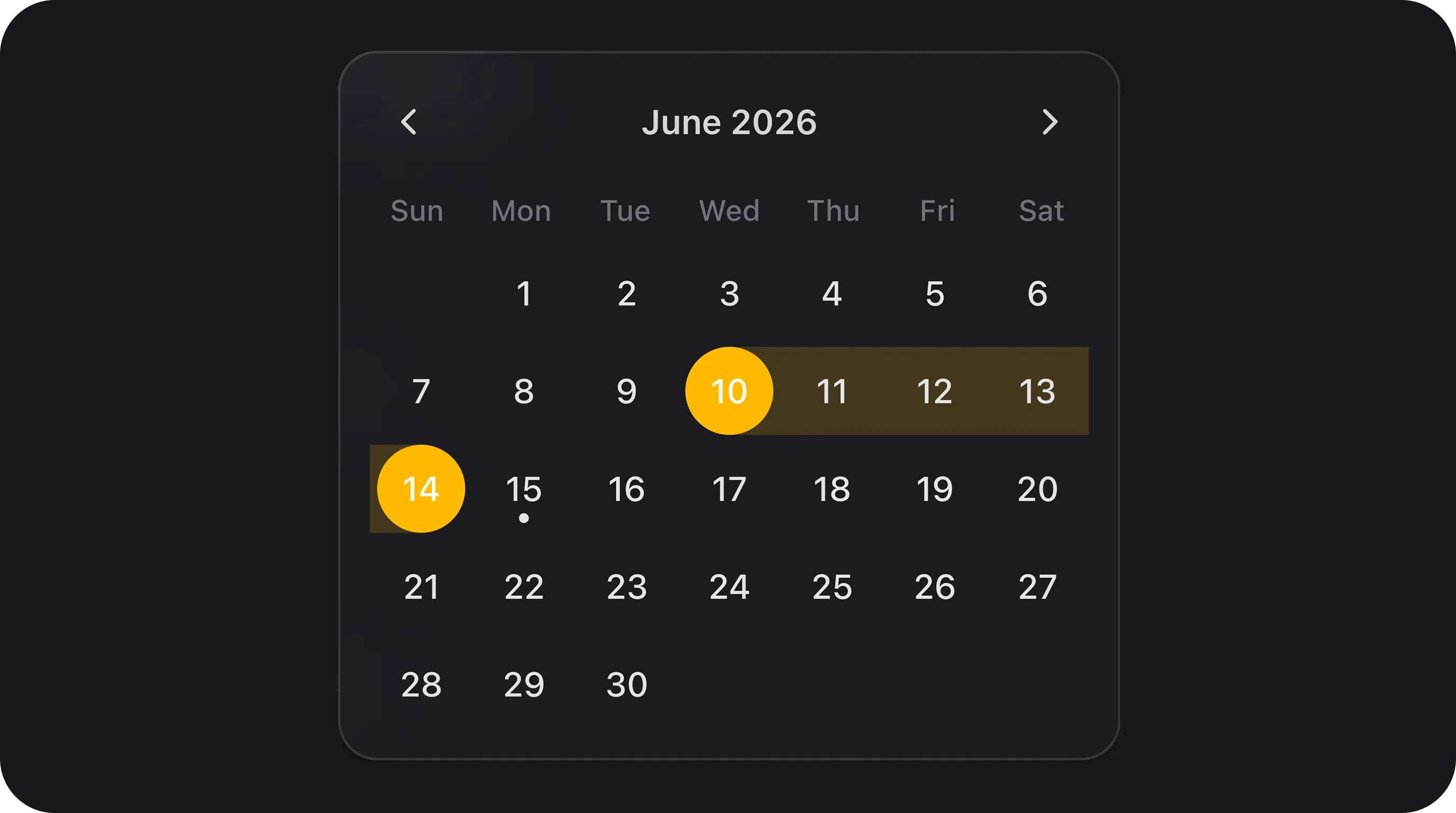
Components withshowCalendar() expose a teleported popover calendar:
- Month navigation — chevron previous/next; header label click drills down: days → months → years (Spectrum-style).
- FlexMonthPicker (with year segment) — opens on the years grid; pick a year → months grid.
- FlexMonthPicker with
showYearSegment(false)— opens directly on the months grid (no year selection step). - FlexYearPicker — year grid only.
- Locale — calendar labels use the configured locale; month names in the grid are always short form. RTL locales mirror the calendar UI (
dir, nav chevrons, weekday order, range bar edges). - Range selection — continuous pill highlight between start and end; hover preview while selecting end.
- Today — optional dot via
highlightToday(). - Primary color — selected day uses theme
--primary-500. - Time under calendar — when time granularity is enabled, editable time segments appear below the grid (single row for
FlexDateTimePicker, start/end rows forFlexDateRangeField).
FlexField schema config
When usingFlexFieldFormBuilder, these FieldType values map to components with withRecommendedDefaults():
FlexDatePicker, custom displayFormat, etc.).
Public helper methods
CSS classes
Textual month segments set CSS variable
--fff-date-time-month-ch on the root wrapper for character-width sizing.
Segment focus uses theme primary (--primary-500) for active background and ring.
Implementation notes
- Client logic:
resources/js/components/flex-date-time-field.js(Alpine), bundled toresources/dist/components/flex-date-time-field.js. - Date math:
@internationalized/dateviaresources/js/core/date-time/. - SSR segment values in Blade prevent layout shift on first paint; Alpine hydrates from
initialSegments. - Playground section Date & time fields in
DateTimeFieldPlaygrounddemonstrates all variants, configuration presets, and bounds/format examples. - Playground section Month display in
DateTimeFieldPlaygrounddemonstratesmonthDisplay()(numeric, short, long) across month picker, date, and datetime fields, plusshowYearSegment(false)month-only mode. - Rebuild assets after CSS/JS changes:
Playground
Slug:date-time-fields
/admin/flex-fields-playground/date-time-fields — see Playground.