Summary
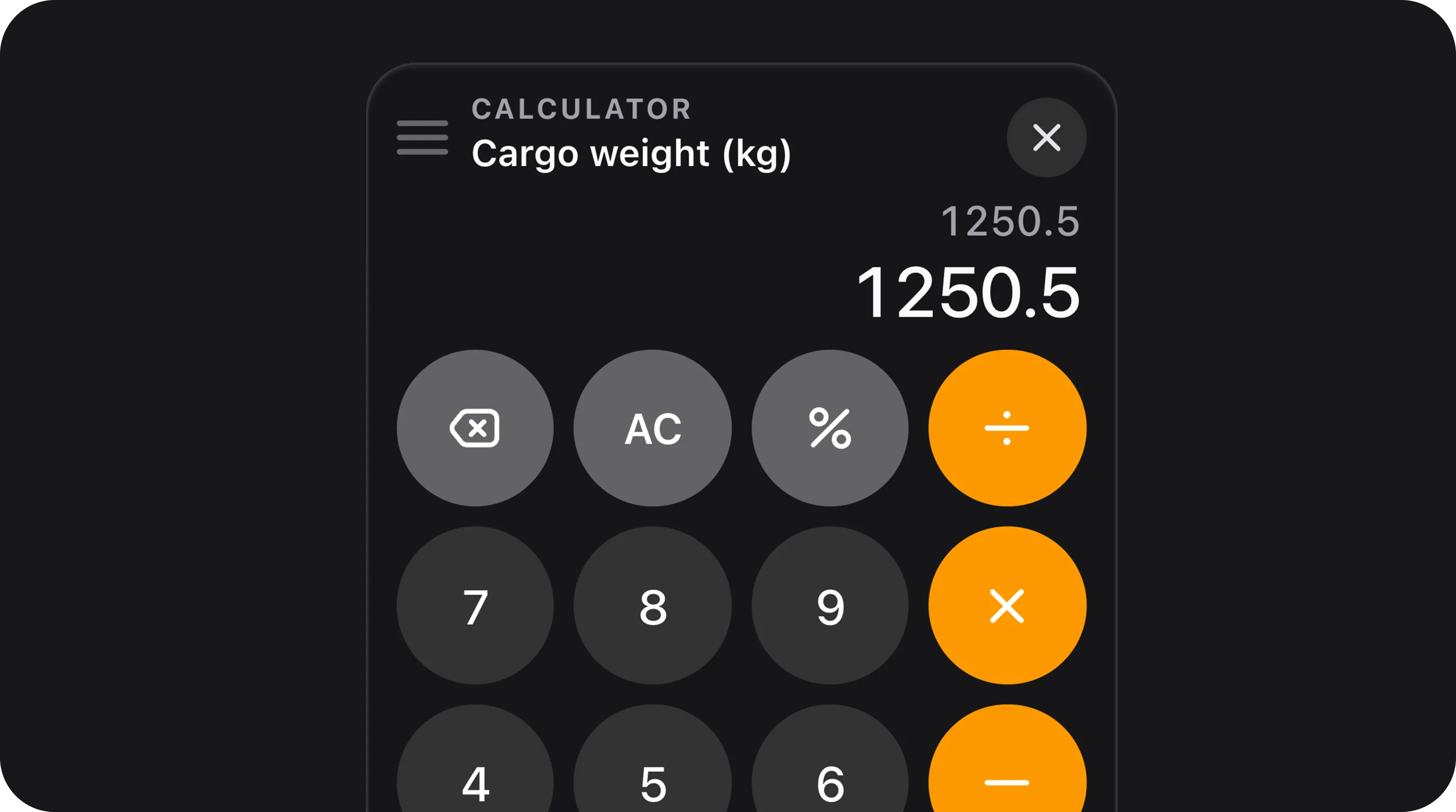
Numeric text input with a calculator trigger and a shared floating panel (one panel per page). Users can type directly or open the keypad to build expressions, preview results live, and Insert the computed value into the active field. EachCalculatorField keeps its own expression session — switch fields without closing the panel.
Works with all standard Filament field APIs:
required(), disabled(), readOnly(), hidden(), live(), afterStateUpdated(), validation rules, etc.
Panel at a glance
The panel mount renders once per page via
@once in the field Blade view (data-fff-calculator-panel-host).
Basic usage
Standard weight input
Filament resource form
Integer-only quantity
State & validation
Stored value
State is a numeric value (int or float) or null when nullable and empty.
Validation rules (built-in)
Direct typing vs calculator Insert
Example: with
->decimalPlaces(2) and ->roundingMode('truncate'), typing 9.9999 in the panel shows 9.9999; Insert stores 9.99.
Numeric constraints
All methods acceptClosure unless noted.
Rounding modes
Max digit length
Useful for database columns with fixed precision:Visual options
Built on FlexTextInput styling — same variant and size tokens.Variants
Sizes
sm, md, lg).
Rounding (border radius)
rounding() overrides the global default from config/filament-flex-fields.php (ui.field_rounding).
Placeholder & calculator icon
GravityIcon::make('calculator').
Read-only & disabled
Calculator keypad semantics
iOS-style layout: digits,AC, ±, %, +, −, ×, ÷, decimal, equals, backspace.
Operators & precedence
Standard infix evaluation with+, −, ×, ÷, parentheses, and unary minus. Multiplication and division bind tighter than addition and subtraction.
Percent (%)
Divides the last operand by 100 (iOS behavior):
Sign toggle (±)
Negates the last operand. After an operator, negatives use parentheses:
All clear (AC)
Clears the expression and resets the display to 0. Insert after AC writes 0 into the field (subject to normalization).
Equals (=)
Replaces the expression with the computed result so you can continue calculating.
Insert
Writes the primary display value into the active field, normalizes it, syncs Livewire state, and keeps the panel open. The field trigger showsis-panel-target while its session is active.
Complete configuration API
Public helper methods
Real-world examples
Shipping form with live total
Margin with percent-friendly calculator
Wizard step — optional estimate
Strict integer inventory
Database & Eloquent
Migration
Model
Assets & deployment
Run after install or upgrade:
calculator-field → flex-text-input, calculator-panel.
Accessibility
- Field root uses
role="group"witharia-labelfrom the field label. - Calculator trigger exposes
aria-label(translatable Open calculator) andaria-expandedwhen active. - Panel close button has an accessible label; keypad keys are native
<button>elements. - Mobile bottom sheet includes a visual drag handle (
aria-hidden). - Respects
prefers-reduced-motionfor panel and context-switch animations.
filament-flex-fields::default.calculator.* (title, placeholder, open, apply, close).
Performance
Playground
/admin/flex-fields-playground/calculator-field
See Playground for setup.
Related components
CSS classes (reference)
Field
Field also reuses
fff-flex-text-input and fff-flex-text-input--{size\|variant} classes.