Summary
Styled wrapper around Filament’s Slider with a SaaS-like pill rail, accent fill, capsule thumb, and optional in-track step dots. Supports single values or dual-handle ranges with server-rendered pips and fill segments to prevent layout shift.| Class | Bjanczak\FilamentFlexFields\Filament\Forms\Components\FlexSlider |
| State type | int|float or [min, max] for range |
| FieldType | flex_slider |
| Parent | Filament\Forms\Components\Slider |
| Playground | flex-slider slug in Flex Fields playground |
Basic usage
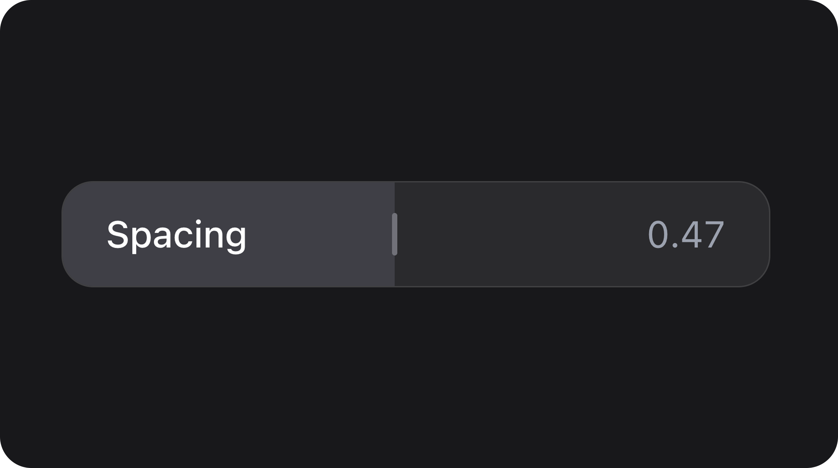
Standard Volume Slider
Dual-Handle Price Range
State & validation
Stored value
State is a numeric value or an array of two numeric values for range mode.Validation rules
Inherits Filament Slider rules (min, max, step, etc.).
Configuration API
All methods acceptClosure unless noted.
| Method | Type | Default | Description |
|---|---|---|---|
showValue(bool $condition) | Setup | false | Display current value in footer |
prefix(string $prefix) | Setup | null | Value prefix |
suffix(string $suffix) | Setup | null | Value suffix |
variant(string $variant) | Setup | 'default' | default, secondary |
trackLabel(string $label) | Setup | null | Label shown inside or above track |
hideThumbUntilInteraction(bool $condition) | Setup | false | Thumb appears on hover/drag |
valuePosition(string $position) | Setup | 'end' | Footer value position: start, center, end |
autoFill(bool $condition) | Setup | false | Automatically fill segments between handles |
color(string $color) | Setup | 'primary' | Filament color for track/thumb |
fillColor(string $color) | Setup | null | Custom hex/rgb for fill accent |
showStepDots(bool $condition) | Setup | false | Render dots at each step interval |
size(string $size) | Setup | 'md' | sm, md, lg |
Real-world examples
Opacity Control with Tooltips
Rating Scale with Pips
Playground
/admin/flex-fields-playground/flex-slider
See Playground for setup.
Related components
| Component | When to use instead |
|---|---|
| TrackSlider | Minimalist track-based slider without handles |
| NumberStepper | Precise numeric stepping with buttons |
| RatingField | Star-based rating input |
CSS classes (reference)
| Class | Role |
|---|---|
fff-flex-slider | Root wrapper |
fff-flex-slider--{sm|md|lg} | Size variant |
fff-flex-slider--{variant} | Visual variant |
fff-flex-slider__control | Main slider container |
fff-flex-slider__rail | Interactive track area |
fff-flex-slider__fill | Active range fill |
fff-flex-slider__thumb | Draggable handle |
fff-flex-slider__pip | Scale marker |
fff-flex-slider__step-dot | Step interval indicator |
fff-flex-slider__footer | Value display area |
is-disabled | Disabled state |
is-range | Range mode active |