Summary
Minimalist track-based range slider where the entire bar acts as the interactive surface. Features a clean, handle-less design with optional live value output and track labels. Often used for percentage inputs or subtle settings.| Class | Bjanczak\FilamentFlexFields\Filament\Forms\Components\TrackSlider |
| State type | int|float |
| Model cast | 'volume' => 'integer' or 'float' |
| FieldType | range_slider, percentage |
| Playground | track-slider slug in Flex Fields playground |
Basic usage
Standard Percentage
Settings Control
State & validation
Stored value
State is a numeric value (int or float).
Validation rules
Built-inNumberStateCast ensures numeric state. Standard Filament rule('min:0') etc. can be added.
Configuration API
All methods acceptClosure unless noted.
| Method | Type | Default | Description |
|---|---|---|---|
min(int|float $min) | Setup | 0 | Lower bound |
max(int|float $max) | Setup | 100 | Upper bound |
step(int|float $step) | Setup | 1 | Increment step |
integer(bool $condition) | Setup | true | Snap to whole numbers |
showOutput(bool $condition) | Setup | true | Display current value inside track |
suffix(string $suffix) | Setup | null | Value suffix (e.g. %) |
variant(string $variant) | Setup | 'default' | default, secondary |
decimalPlaces(int $places) | Setup | null | Fixed decimal precision |
trackLabel(string $label) | Setup | null | Label shown inside the track |
size(string $size) | Setup | 'md' | sm, md, lg |
Real-world examples
Volume Control
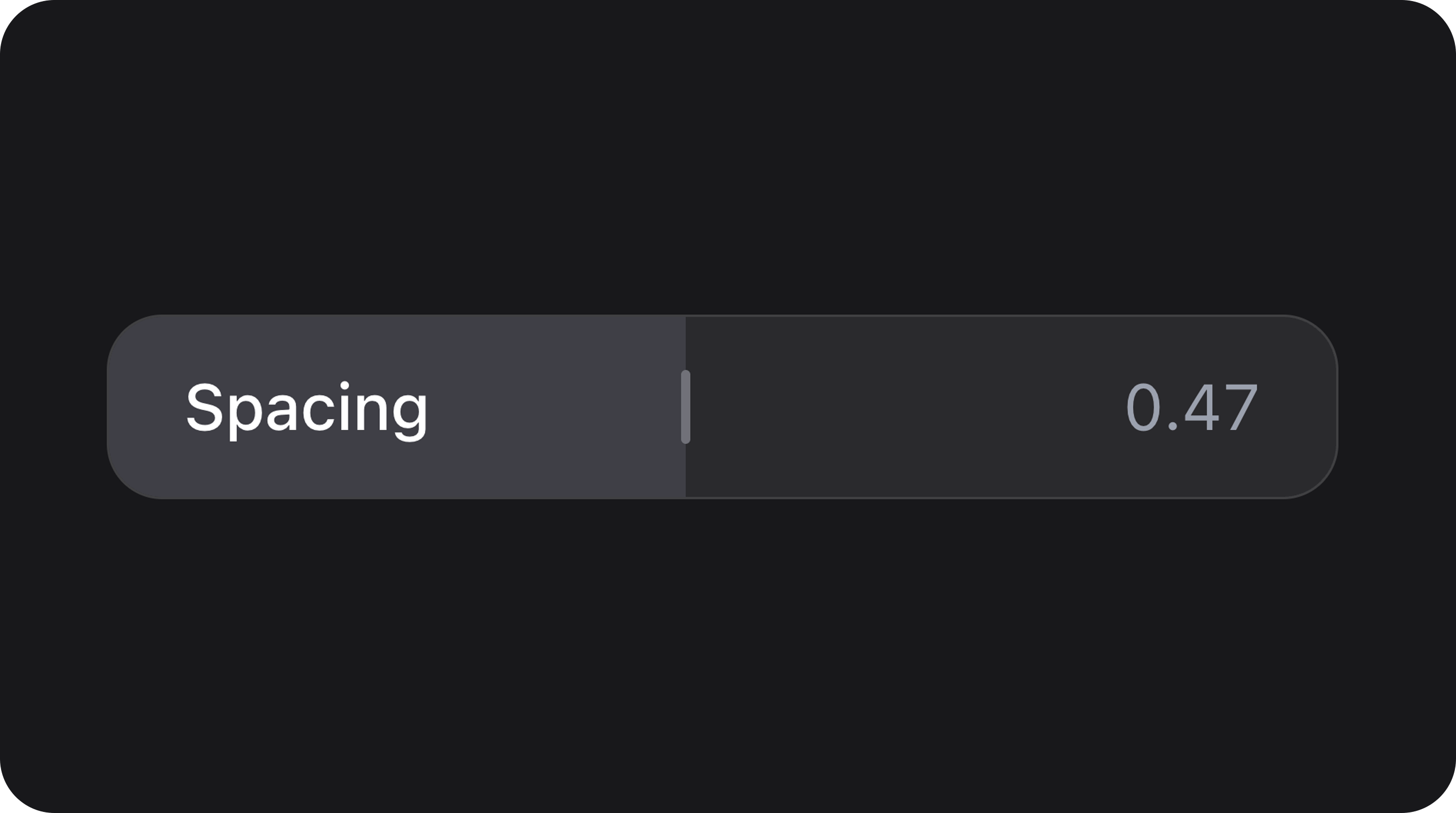
Fine-tuned Spacing
Playground
/admin/flex-fields-playground/track-slider
See Playground for setup.
Related components
| Component | When to use instead |
|---|---|
| FlexSlider | Traditional slider with draggable handles |
| NumberStepper | Numeric input with increment/decrement buttons |
| ProgressBar | Read-only visual progress indicator |
CSS classes (reference)
| Class | Role |
|---|---|
fff-track-slider | Root wrapper |
fff-track-slider--{sm|md|lg} | Size variant |
fff-track-slider--{variant} | Visual variant |
fff-track-slider__track | Main interactive bar |
fff-track-slider__fill | Active range indicator |
fff-track-slider__thumb | Subtle indicator (visible on hover/drag) |
fff-track-slider__track-label | Label inside the track |
fff-track-slider__output | Value output inside the track |
is-disabled | Disabled state |
is-dragging | Active drag state |