value(float|int|Closure|null $value) | Setup | 0 | Current progress value. |
max(float|int|Closure $max) | Setup | 100 | Maximum progress value. |
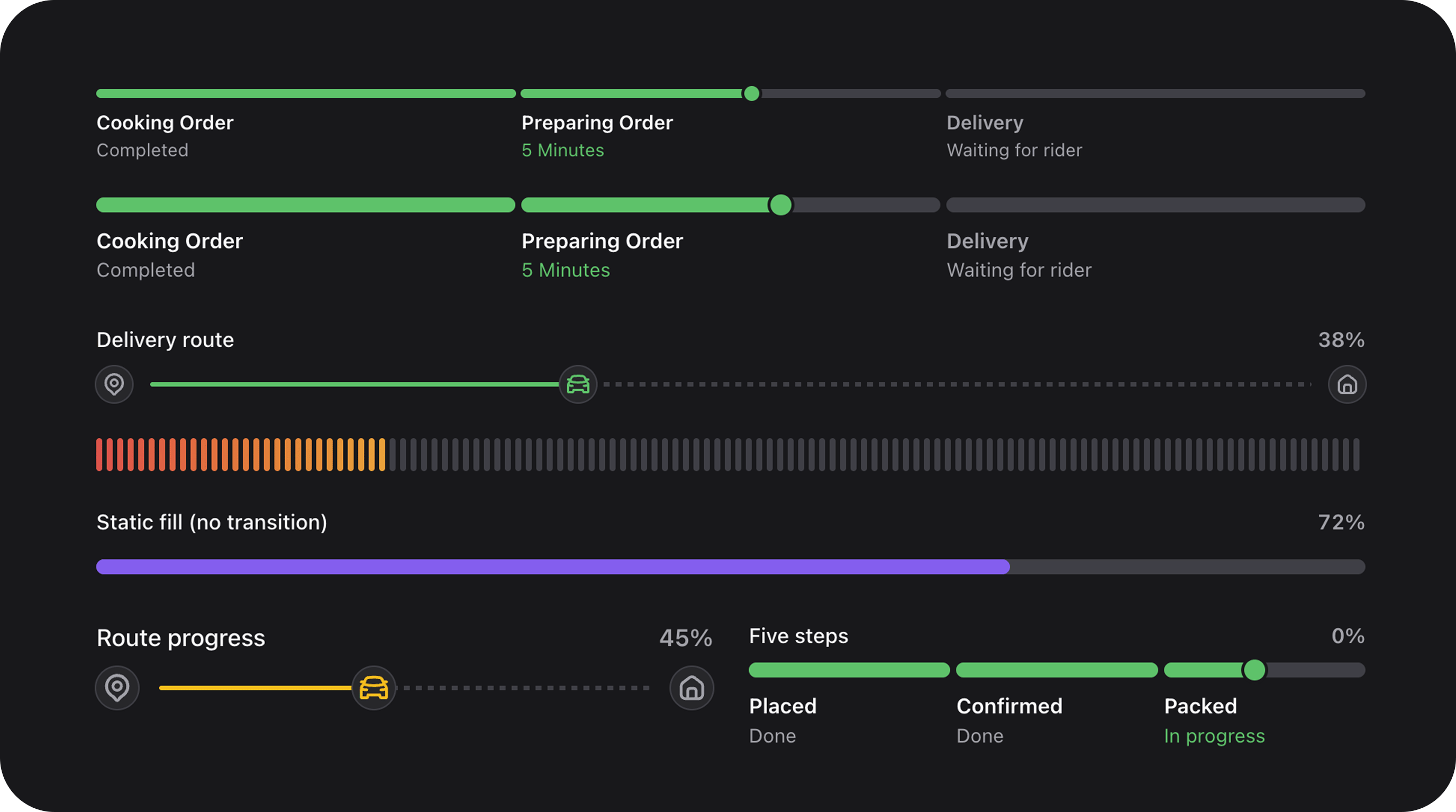
label(string|Closure|null $label) | Setup | null | Header text shown above the track. |
displayValue(string|Closure|null $value) | Setup | null | Custom formatted value string (e.g., “3 of 5 files”). |
showValue(bool|Closure $condition = true) | Setup | true | Show percentage or display value in the header. |
valueBadge(bool|Closure $condition = true) | Setup | false | Render the value as a pill badge in the header. |
color(string|Closure|null $color) | Setup | primary | Semantic color: primary, success, warning, danger. |
indeterminate(bool|Closure $condition = true) | Setup | false | Animated loading bar for unknown progress. |
variant(string|Closure $variant) | Setup | 'track' | track (continuous) or pills (segmented). |
pillCount(int|Closure $count) | Setup | null | Number of segments in pills variant. |
gradientFrom(string|Closure|null $color) | Setup | null | Start color for gradient fill. |
gradientTo(string|Closure|null $color) | Setup | null | End color for gradient fill. |
segments(array|Closure|null $segments) | Setup | null | Array of step metadata for delivery-tracker mode. |
activeSegment(int|Closure|null $index) | Setup | null | 0-based index of the active step. |
activeSegmentProgress(float|Closure $progress) | Setup | 0.62 | Partial fill (0–1) within the active step. |
segmentThumb(bool|Closure $condition = true) | Setup | auto | Show a thumb indicator on the active segment. |
startMarker(mixed $icon) | Setup | null | Icon at the beginning of the track. |
currentMarker(mixed $icon) | Setup | null | Icon at the current progress position. |
endMarker(mixed $icon) | Setup | null | Icon at the end of the track. |
remainingTrackStyle(string $style) | Setup | 'solid' | Style of unfilled track: solid or dashed. |
shell(bool|Closure $condition = true) | Setup | false | Wrap in an elevated card container. |
description(string|Closure $text) | Setup | null | Subtitle text (requires shell()). |
footer(string|Closure $text) | Setup | null | Footer text (requires shell()). |
size(string|Closure $size) | Setup | 'md' | Track height: sm, md, lg. |
animated(bool|Closure $condition = true) | Setup | true | Animate fill transitions. |
animationDuration(int|Closure $ms) | Setup | 400 | Transition duration in milliseconds. |