Summary
Grouped list surface that wraps multipleItemCard rows in a single bordered container. Features optional group headers, row separators, group-level variants, and group-wide pressable row behavior.
| Class | Bjanczak\FilamentFlexFields\Filament\Schemas\Components\ItemCardGroup |
| State | None — display/layout component |
| Playground | item-card-group slug in Flex Fields playground |
| Extends | Filament\Schemas\Components\Component |
Basic usage
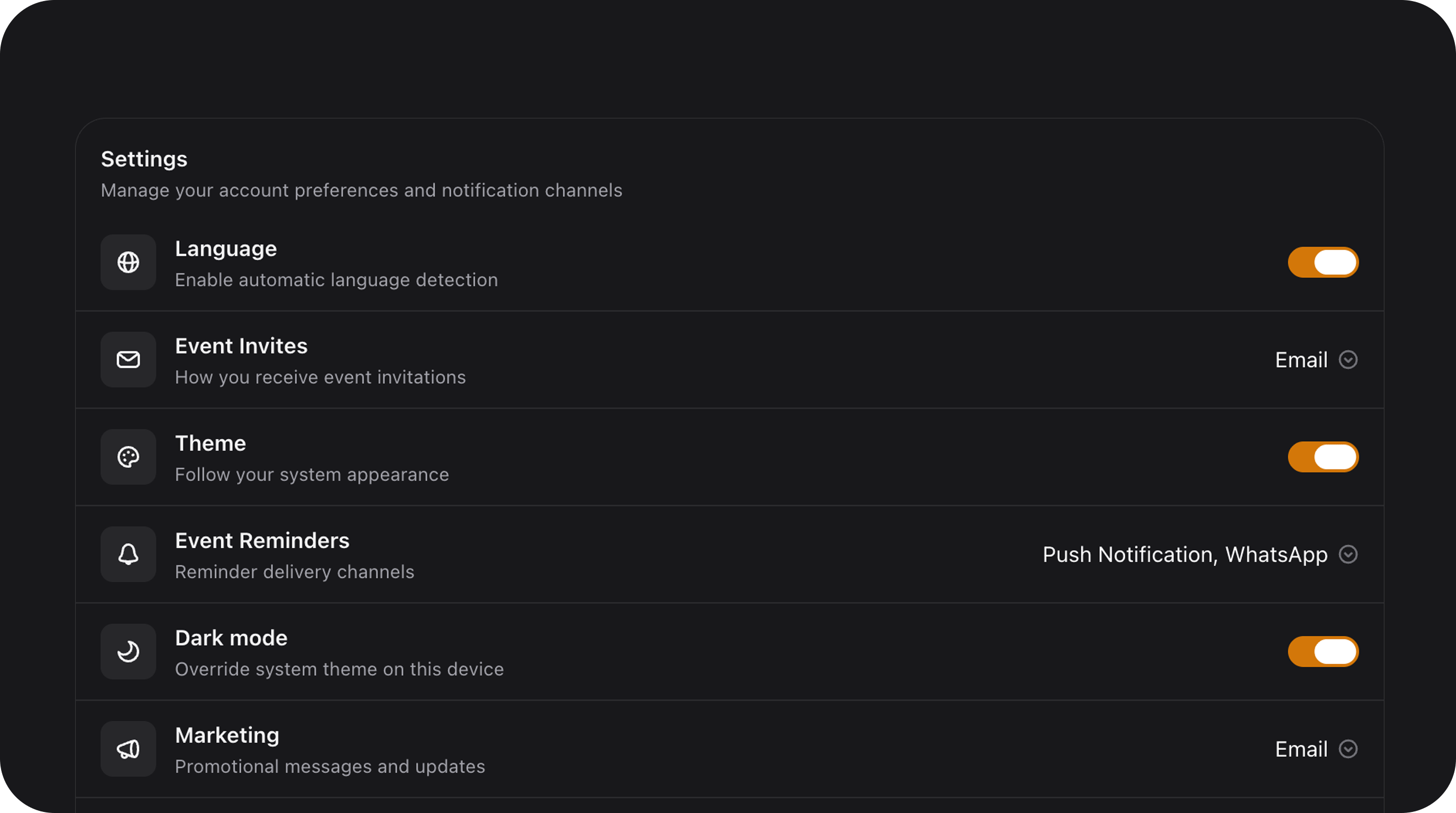
Standard settings group
Outside header with pressable rows
Configuration API
All methods acceptClosure unless noted.
| Method | Type | Default | Description |
|---|---|---|---|
heading(string|Htmlable|Closure $text) | Setup | null | Group title text. |
description(string|Htmlable|Closure $text) | Setup | null | Group subtitle text. |
schema(array|Closure $components) | Setup | [] | Child rows (typically ItemCard instances). |
variant(string|Closure $variant) | Setup | 'default' | Surface style: default, secondary, tertiary, outline, transparent. |
layout(string|Closure $layout) | Setup | 'list' | Child arrangement: list or grid. |
divided(bool|Closure $on) | Setup | false | Enable horizontal separators between rows. Alias: separated(). |
headerStyle(string|Closure $style) | Setup | 'embedded' | embedded (inside box) or outside (above box). |
pressable(bool|Closure $on) | Setup | false | Enable group-wide hover/ripple for child rows. |
Public helper methods
| Method | Returns | Description |
|---|---|---|
getLayout() | string | list or grid. |
getVariant() | string | Resolved group variant. |
isDivided() | bool | Whether row separators are active. |
getHeaderStyle() | string | embedded or outside. |
areRowsPressable() | bool | Group-level pressable flag. |
Real-world examples
Mixed controls group
Grid layout for cards
Playground
/admin/flex-fields-playground/item-card-group
See Playground for setup.
Related components
| Component | When to use instead |
|---|---|
| ItemCard | For individual list rows outside of a group. |
| ChoiceCards | When the group represents a selectable form state. |
| SegmentTabs | For switching between different form schemas using segments. |
CSS classes (reference)
| Class | Role |
|---|---|
item-card-group | Main group container |
item-card-group-host | Outside-header wrapper |
item-card-group--{layout} | List or grid layout modifier |
item-card-group--{variant} | Surface variant modifier |
item-card-group--divided | Row separators active |
item-card-group-header | Title and description container |
item-card-group-surface | The bordered box element |
item-card-group-content | Child components container |