Summary
Media card for hero banners, product tiles, and call-to-action blocks. Supports background images, gradients, or solid colors, with optional top/footer copy and a footer action button.| Class | Bjanczak\FilamentFlexFields\Filament\Schemas\Components\CoverCard |
| State | None — display/action component |
| Playground | cover-card slug in Flex Fields playground |
| Extends | Filament\Schemas\Components\Component |
Basic usage
Portrait product card
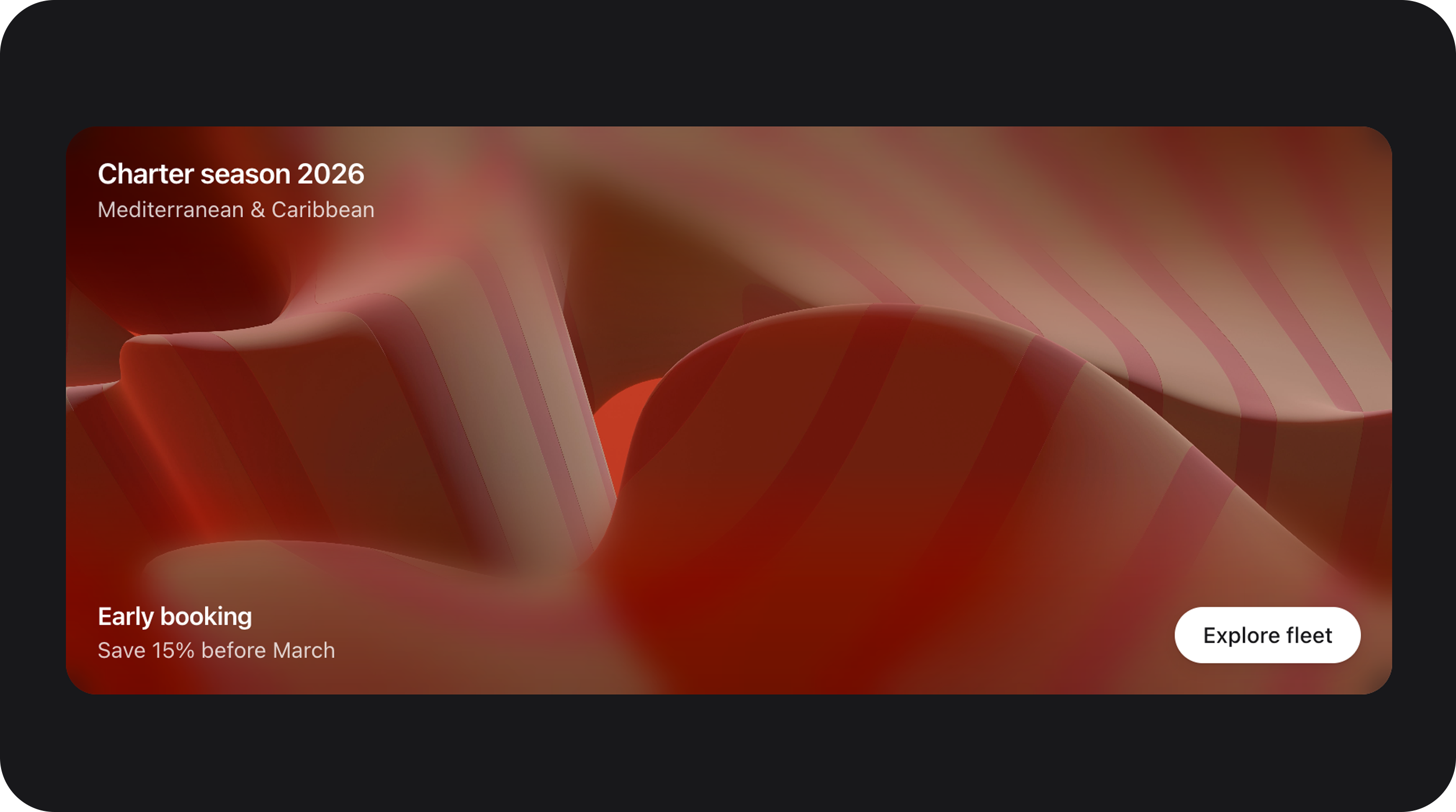
Full-width cinematic banner
Configuration API
All methods acceptClosure unless noted.
| Method | Type | Default | Description |
|---|---|---|---|
backgroundImage(string|Closure|null $url) | Background | null | Cover image URL. Sanitized via SafeMediaUrl. |
backgroundGradient(string|Closure|null $css) | Background | null | CSS gradient string (used if no image is set). |
backgroundColor(string|Closure|null $color) | Background | null | Fallback / underlay color. |
backgroundPosition(string|Closure $pos) | Background | 'center' | CSS background-position. |
ratio(string|Closure|null $ratio) | Layout | '3:4' | Aspect ratio (e.g., 16:9, 1:1, auto). |
fullWidth(bool|Closure $condition = true) | Layout | false | Removes the default 20rem max-width constraint. |
contentMaxWidth(string|Closure $width) | Layout | null | Custom max-width when not full width. |
topTitle(string|Closure $text) | Content | null | Header title text. |
topDescription(string|Closure $text) | Content | null | Header description text. |
footerTitle(string|Closure $text) | Content | null | Footer title text. |
footerDescription(string|Closure $text) | Content | null | Footer description text. |
footerAction(Action|Closure $action) | Content | null | Filament Action rendered as a pill CTA. |
tone(string|Closure $tone) | Appearance | 'dark' | Text/scrim variant: dark or light. |
radius(string|Closure $radius) | Appearance | 'xl' | Corner radius: md, lg, xl, 2xl. |
contentOverlays(bool|Closure $on) | Appearance | false | Enables separate top/bottom gradient overlays. |
topOverlayGradient(string $css) | Appearance | null | Custom CSS gradient for top overlay. |
footerOverlayGradient(string $css) | Appearance | null | Custom CSS gradient for bottom overlay. |
Public helper methods
| Method | Returns | Description |
|---|---|---|
getAspectRatioStyle() | ?string | Resolved CSS aspect-ratio value. |
getBackgroundStyles() | array | Inline style fragments for the background layer. |
hasTopContent() | bool | Whether top copy blocks are filled. |
hasFooterContent() | bool | Whether footer copy or action exists. |
Real-world examples
Gradient feature strip
Vertical card in a grid
Playground
/admin/flex-fields-playground/cover-card
See Playground for setup.
Related components
| Component | When to use instead |
|---|---|
| ItemCard | For standard list rows with icons and descriptions. |
| ItemCardGroup | To group multiple item cards in a shared container. |
| ProgressCircle | When the card should focus on a progress metric. |
CSS classes (reference)
| Class | Role |
|---|---|
fff-cover-card | Root card container |
fff-cover-card--tone-{dark|light} | Text contrast variant |
fff-cover-card--radius-{md|lg|xl|2xl} | Corner radius variant |
is-full-width | Full width modifier |
fff-cover-card__background | Background image/color layer |
fff-cover-card__scrim | Global gradient overlay |
fff-cover-card__overlay--top | Top-specific gradient overlay |
fff-cover-card__overlay--bottom | Bottom-specific gradient overlay |
fff-cover-card__content | Copy and action container |
fff-cover-card__footer-action | Action button wrapper |