Summary
Premium single-select card group (radio behavior). Ideal for pricing plans, delivery methods, and feature selection. Supports rich option metadata (descriptions, prices, icons, badges) and multiple responsive layouts.| Class | Bjanczak\FilamentFlexFields\Filament\Forms\Components\ChoiceCards |
| State type | string|int|null — one option key |
| Model cast | 'plan' => 'string' · 'type' => 'integer' |
| FieldType | choice_cards |
| Playground | choice-cards slug in Flex Fields playground |
Basic usage
Pricing plans (Stack layout)
Delivery methods (Media layout)
State & validation
Stored value
State is the option key fromoptions().
Validation rules (built-in)
| Rule | When |
|---|---|
nullable | Always (unless required()) |
Rule::in(...) | Value must match a configured option key |
required | When ->required() |
Configuration API
All methods acceptClosure unless noted.
| Method | Type | Default | Description |
|---|---|---|---|
options(array|Closure $options) | Setup | [] | Rich option map. Keys: label, description, price, price_suffix, icon, badge, badge_color, disabled. |
disabledOptions(array|Closure $keys) | Setup | [] | Keys that cannot be selected. |
layout(string|Closure $layout) | Setup | 'stack' | stack, grid, media, featured. |
gridColumns(int|array|Closure $cols) | Setup | 1 | Responsive columns for grid/media (max 4). |
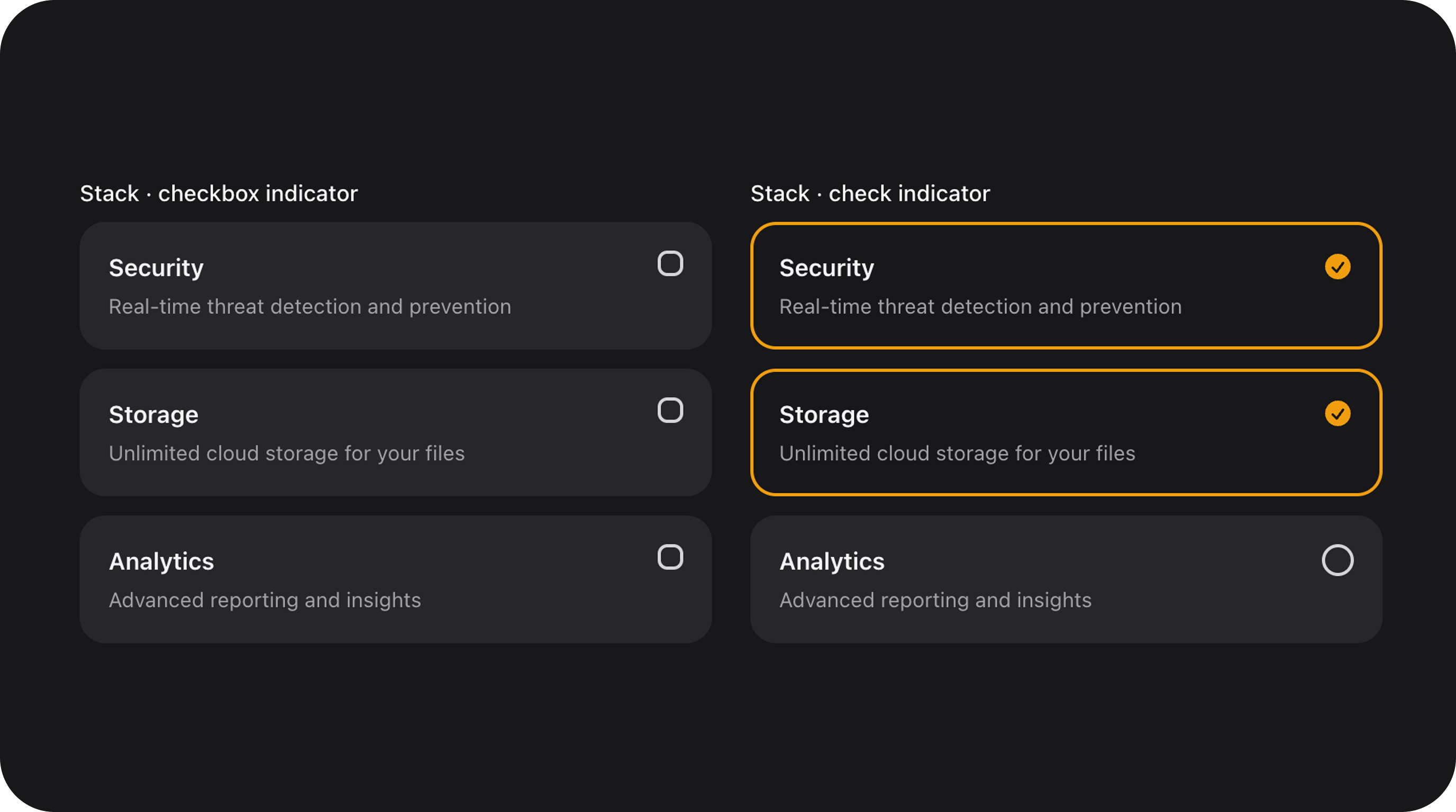
indicator(string|Closure|null $type) | Setup | auto | Selection marker: radio, check, none. |
variant(string|Closure $variant) | Setup | 'default' | default, primary (stronger selection), secondary. |
color(string|Closure|null $color) | Setup | 'primary' | Accent color for selection borders/indicators. |
size(string|Closure $size) | Setup | 'md' | Padding and typography scale: sm, md, lg. |
ripple(bool|Closure $on) | Setup | false | Enable Material-style click ripple. |
Real-world examples
Featured plan selector
Payment method selector
Playground
/admin/flex-fields-playground/choice-cards
See Playground for setup.
Related components
| Component | When to use instead |
|---|---|
| ChoiceCheckboxCards | For multi-select card groups. |
| FlexChecklist | For a more compact multi-select list. |
| ItemCardGroup | For grouping rows that aren’t necessarily selectable form fields. |
CSS classes (reference)
| Class | Role |
|---|---|
fff-choice-cards | Root wrapper |
fff-choice-cards--layout-{stack|grid|media|featured} | Layout modifier |
fff-choice-cards--variant-{default|primary|secondary} | Visual variant |
fff-choice-cards--{sm|md|lg} | Size modifier |
fff-choice-card | Individual card element |
fff-choice-card--selected | Active card state |
fff-choice-card--disabled | Disabled card state |
fff-choice-card__indicator | Selection marker wrapper |
fff-choice-card__ripple | Ripple animation element |