Summary
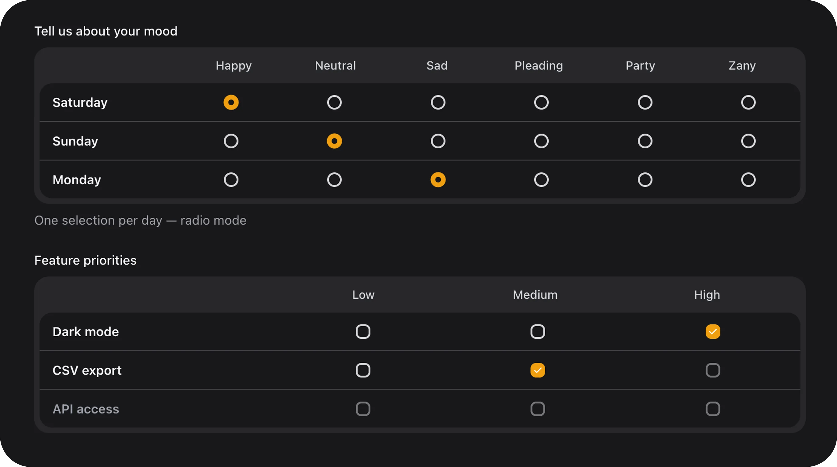
Multiple choice grid (matrix / survey table): row labels on the left, column headers on top, radio or checkbox in each cell. Gray inset frame with white body panel. Per-row validation and reactive conditional disabling (nolive() required).
UsematrixColumns()— notcolumns()— becausecolumns()is reserved by Filament layout grids.
Full example
Row option shape
Each key inrows() is stored in the database. Value can be a plain string (used as label) or a rich array:
Column option shape
Each key inmatrixColumns() is a selectable column id (stored in state).
State format
Radio mode — one column key per row (or omitted if empty):- Default state:
[] - On dehydrate, empty rows and invalid keys are stripped
- Use Eloquent cast
'field' => 'array'or'field' => 'json'
Validation
Built-in (per row)
Translation keys (
resources/lang/en/default.php):
Custom cross-row rules
Use standard Filament->rule() for business logic across rows:
Configuration API
mode('radio'|'checkbox')
rows(array|Closure $rows)
Row definitions — see Row option shape. Accepts Closure for dynamic rows.
matrixColumns(array|Closure $columns)
Column headers — see Column option shape.
columnIcons(array|Closure $icons)
Per-column icon map merged into column metadata:
requiredRows(array|Closure $keys)
Mark rows as required without inline required => true:
disabledRows(array|Closure $keys)
Lock entire rows by key (static, always on):
disabledCells(array|Closure $map)
Lock specific cells. Map shape: rowKey => [columnKey, ...]:
Closure for server-side dynamic maps (re-evaluated on each render; use with live() for server-driven updates).
disableCellWhen($row, $column, $whenRow, $whenColumns)
Reactive (client-side Alpine) — disable one cell when a trigger row matches column key(s). No live() needed.
Invalid selections in newly disabled cells are removed automatically.
disableRowWhen($row, $whenRow, $whenColumns)
Reactive — disable an entire row when trigger row matches:
size('sm'|'md'|'lg')
Control scale for row labels, column headers, and radio/checkbox indicators. Default: md.
color('primary'|'secondary'|'success'|'warning'|'danger'|null)
Filament accent for selected radio/checkbox indicators. Default: primary.
Inherited Filament field API
Also supports standard Inherited Filament field API:Public helper methods
FlexField schema config
disable_cell_when / disable_row_when rule array:
CSS classes
Implementation notes
- Radio/checkbox indicators reuse Flex Radiolist / Flex Checklist animation tokens (
fff-choice-cards-indicator-pop). - All clicks are handled on
fff-matrix-choice__cell; inner inputs usepointer-events-noneto prevent double-toggle. - Conditional rules run in Alpine on every state change;
pruneDisabledSelections()clears invalid picks.
Playground
Slug:matrix-choice
/admin/flex-fields-playground/matrix-choice — see Playground.