Summary
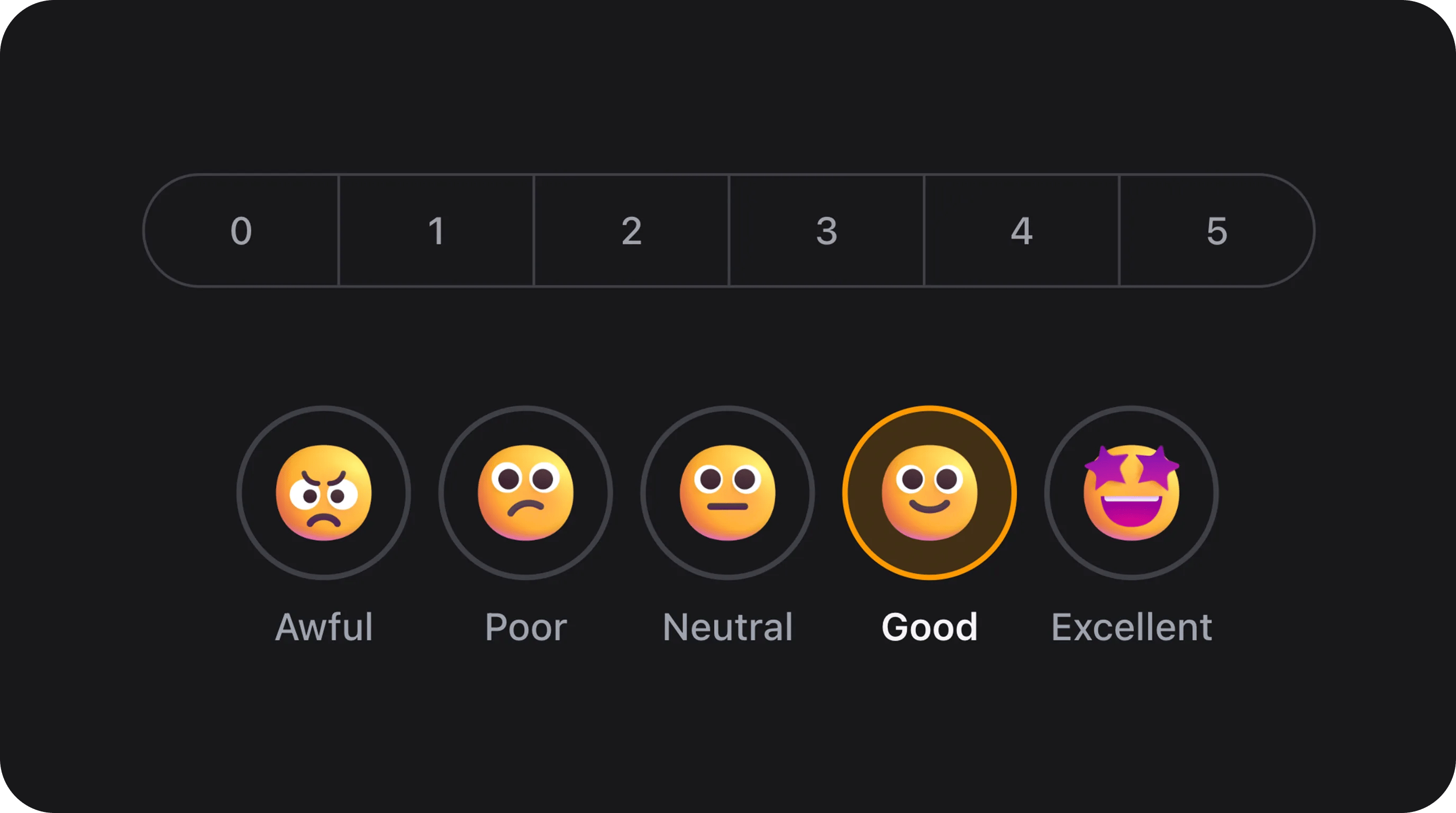
Single-select survey scale for Net Promoter Score (0–10), CSAT, satisfaction ratings, and textual Likert scales. Three visual variants share one API: pills (sliding segment control), segments (full-width bordered bar), and emojis (icon or image rings with labels).
Works with all standard Filament field APIs:
required(), disabled(), hidden(), live(), afterStateUpdated(), validation rules, etc.
Variants at a glance
Basic usage
Standard NPS (0–10)
Filament resource form
Color-coded NPS (Detractor / Passive / Promoter)
State & validation
Stored value
State is the option key fromoptions() — not the display label.
Default: empty initial state
The field defaults tonull. Nothing is selected until the user picks an option. All variants support this.
Validation rules (built-in)
Optional fields — deselect on second click
When the field is notrequired(), clicking the already selected option clears the value back to null. Required fields always keep one selection.
Custom scales
5-point CSAT (1–5)
3-point quick rating
Textual Likert scale (string keys)
Dynamic options with a closure
Variant: Pills (default)
Sliding pill indicator on a gray track — same visual language as SegmentControl. Best for numeric scales and compact layouts.Sizes
sm, md, lg).
Rounding
rounding() overrides the global default from config/filament-flex-fields.php (ui.field_rounding).
Variant: Segments
Full-width bordered bar with vertical dividers between options. Ideal for 0–10 NPS and multi-option Likert rows.Segments with sizes and rounding
Variant: Emojis
Circular rings with a visual inside each option and a text label below. Three ways to supply visuals (priority order):icons()— Filament icon strings (Heroicon, Gravity, Blade Icons, …)emojiImages()— custom image URLs- Bundled webp — for numeric keys
0–4when neither of the above is set
Bundled emoji images (5-point mood scale)
resources/dist/assets/nps-field/emojis/0.webp … 4.webp) and are published to public/filament-flex-fields-assets/ via php artisan filament:assets.
Custom Gravity / Heroicon icons
icons() is set for a key, it overrides bundled webp for that key.
Custom image URLs
Emoji sizes
Color coding & custom colors
Built-in NPS color coding
Custom per-option background colors
Map Filament semantic names, hex, or rgb to option keys:Custom selected text colors
colorCoded() is enabled, built-in detractor/passive/promoter colors apply unless you override with colors() / textColors().
Disabled options
Disable individual keys without disabling the whole field:disabled():
Edge labels
Show helper text under the left and right ends of the scale:options() values.
Complete configuration API
All methods acceptClosure unless noted.
Public helper methods
Real-world examples
Post-purchase survey (CreateRecord)
Wizard step — optional NPS
Live reactive form
Infolist / table display (manual)
NpsField is a form component. Display stored values in tables with TextColumn or a custom column:
Database & Eloquent
Migration
Model
Assets & deployment
Fields resolve bundled emoji URLs via
FlexFieldAssets::assetUrl() with automatic ?v=filemtime cache busting.
On upgrade, run php artisan filament:assets (or use a Composer post-autoload-dump hook). See the main README Upgrading section.
Accessibility
- Root element uses
role="radiogroup"witharia-labelfrom the field label. - Each option is a
<label role="radio">witharia-checkedand keyboard support (Enter/Space). - Hidden native
<input type="radio">elements preserve form semantics. - Focus visible outline on keyboard navigation.
- Disabled options expose
aria-disabled="true".
Performance
Stylesheet dependency graph:
nps-field → segment-control (pills variant only).
Playground
/admin/flex-fields-playground/nps-field
See Playground for setup.
Related components
CSS classes (reference)
Pills variant reuses
fff-segment-control, fff-segment-track, fff-segment-indicator, and fff-segment-item from SegmentControl.