Summary
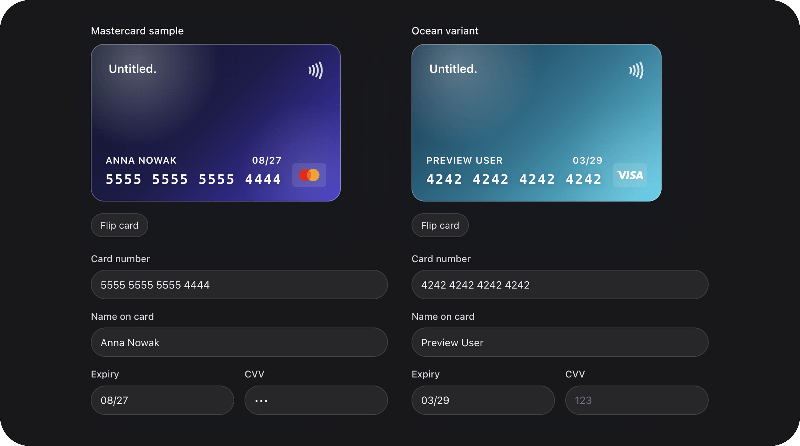
Payment input that combines four fields (number, name, expiry, CVV) into one cohesive component. Includes an interactive 3D-style card preview that flips when focusing the CVV field and validates numbers using the Luhn algorithm.| Class | Bjanczak\FilamentFlexFields\Filament\Forms\Components\CreditCardField |
| State type | array — {number, name, expiry, cvv} |
| Model cast | 'payment_method' => 'array' |
| FieldType | credit-card |
| Playground | credit-card slug in Flex Fields playground |
| Default variant | midnight |
Basic usage
Standard payment form
Custom labels and variant
State & validation
Stored value
The field stores an array of card details. Note that for security, you should usually only store thenumber (masked), name, and expiry in your database, while sending the full details to your payment processor.
Built-in Validation
CreditCardField performs several automatic checks:
- Luhn Check: Validates the card number checksum.
- Expiry Date: Ensures the card is not expired and the format is
MM/YY. - CVV Format: Validates 3 or 4 digit numeric codes.
- Required Fields: If
required(), all four sub-fields must be filled.
Visual Customization
Variants
Choose from four built-in card themes:| Variant | Colors |
|---|---|
midnight | Deep dark / black (default) |
ocean | Blue gradient |
sunset | Orange / red gradient |
slate | Neutral gray |
Input Variants
Change the style of the text inputs below the card:primary: Standard bordered inputs.secondary: Subtle background-only inputs.flat: Minimalist underline style.
Configuration API
All methods acceptClosure unless noted.
| Method | Type | Default | Description |
|---|---|---|---|
variant(string|Closure $variant) | Setup | 'midnight' | Card theme: midnight, ocean, sunset, slate |
inputVariant(string|Closure $var) | Setup | 'primary' | Input style: primary, secondary, flat |
flipOnCvvFocus(bool|Closure $cond) | Setup | true | Flip card to back when CVV is focused |
numberLabel(string|Closure $label) | Setup | (trans) | Card number field label |
nameLabel(string|Closure $label) | Setup | (trans) | Cardholder name field label |
expiryLabel(string|Closure $label) | Setup | (trans) | Expiry date field label |
cvvLabel(string|Closure $label) | Setup | (trans) | CVV field label |
mark(string|Closure $mark) | Setup | 'CARD' | Text shown on the card preview |
size(string|Closure $size) | Setup | 'md' | sm, md, lg |
rounding(string|Closure $round) | Setup | config | Border radius token |
focusOutline(bool|Closure $cond) | Setup | true | Show focus rings on inputs |
Real-world examples
Checkout Page Section
Playground
/admin/flex-fields-playground/credit-card
See Playground for setup.
Related components
| Component | When to use instead |
|---|---|
| FlexTextInput | Single masked input for card number only |
| SelectField | Selecting from saved payment methods |
| AddressAutocomplete | Billing address collection |
CSS classes (reference)
| Class | Role |
|---|---|
fff-credit-card-field | Root wrapper |
fff-credit-card-field__preview | The 3D card container |
fff-credit-card-field__card-front | Front side of card |
fff-credit-card-field__card-back | Back side of card |
fff-credit-card-field__inputs | Grid of text inputs |
fff-credit-card-field--{variant} | Theme variant class |
fff-credit-card-field--input-{variant} | Input style variant class |